How to make your app feel alive: Animations in Cards

Context
Today we will look at the features that will make your application come alive, give it a bright color and delight users. After all, it’s the little things in the form of animation that leave big emotions. And this can be done not only with native technologies. Therefore, let’s have a look into Cards module of our Retail application.
Loading state
Most of apps need to retrieve data from remote server or some local database and so on. Initially when we don’t have anything to show and we need to wait, common practice to show loader/spinner on the center. But in Cards, just like in most of screens in Retail, we decided to go with shimmers. You may use some popular packages or create it via fragment shaders by yourself.
But when we already have all the data, and some new loading is happening, for instance we are freezing the card, hence we could show spinner on the button instead of hiding all the screen under spinner. We block user interaction while operating is being performed, but visually everything works pretty well.
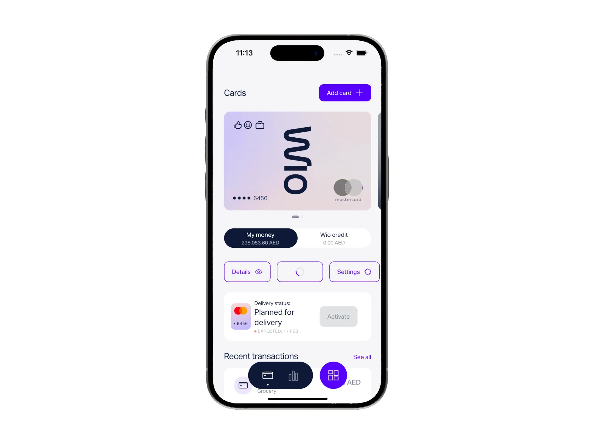
Cards Main menu
From the video above you may see how it looks very user-friendly and smooth. We achieve such experience via using:
1. GIF animation as the card texture, it makes it lookalike an alive element, We started with Lottie, but faced problem with rendering some colors with fade-in effects/gradients.
2. During scroll we shrink our card and all the elements inside card starts flying/moving/disappearing and so on. Looks fantastic, and the implementation is not so difficult. It’s just power of the Slivers.
abstract class SliverPersistentHeaderDelegate {
  /// Abstract const constructor. This constructor enables subclasses to provide
  /// const constructors so that they can be used in const expressions.
  const SliverPersistentHeaderDelegate();

  /// The widget to place inside the [SliverPersistentHeader].
  ///
  /// The `context` is the [BuildContext] of the sliver.
  ///
  /// The `shrinkOffset` is a distance from [maxExtent] towards [minExtent]
  /// representing the current amount by which the sliver has been shrunk. When
  /// the `shrinkOffset` is zero, the contents will be rendered with a dimension
  /// of [maxExtent] in the main axis. When `shrinkOffset` equals the difference
  /// between [maxExtent] and [minExtent] (a positive number), the contents will
  /// be rendered with a dimension of [minExtent] in the main axis. The
  /// `shrinkOffset` will always be a positive number in that range.
  ///
  /// The `overlapsContent` argument is true if subsequent slivers (if any) will
  /// be rendered beneath this one, and false if the sliver will not have any
  /// contents below it. Typically this is used to decide whether to draw a
  /// shadow to simulate the sliver being above the contents below it. Typically
  /// this is true when `shrinkOffset` is at its greatest value and false
  /// otherwise, but that is not guaranteed. See [NestedScrollView] for an
  /// example of a case where `overlapsContent`'s value can be unrelated to
  /// `shrinkOffset`.
  Widget build(BuildContext context, double shrinkOffset, bool overlapsContent);

  ...
}
Create your own SliverPersistentHeaderDelegate for SliverPersistentHeader, it has method build with shrinkOffset with which you can manipulate your UI.
We find progress of shrinking by expression below, and pass it further into widgets for simplifying all the work.
final shrinkProgress = shrinkOffset.clamp(0, maxExtent - minExtent) / maxExtent;3. Card flipping effect - it’s just and ordinary AnimatedSwitcher widget. AnimatedSwitcher is a very powerful widget which was given from the box. Let’s imagine that we have code below:
Widget build () {
  return AnimatedSwitcher (
    duration: const Duration(seconds: 1),
    child: _showRed ? _RedBox () : _BlueBox(), // _showRed = true
  );
}
What do you think will happen on the screen, when we change value of _showRed into false? Answer is: “User will see show _RedBox faded out and _BlueBox appeared with fade in animation“ . But you may ask like “ok, but how card flipped with this widget?“. AnimatedSwitcher is flexible widget and we applied custom transitionBuilder into it, which transforms the card by rotating it. You can put here anything you want: “Sliding, Scaling, FadeIn and so on“.
4. Fade out animation - when card is unblocked/blocked we show dark overlay with fade in effect. It’s same as 3rd point actually. But one interesting point here is that we should do fade in only when state of card is changed. Probably it could be like:
Widget build () {
  return AnimatedSwitcher (
    duration: const Duration(seconds: 1),
    child: CardWidget(
       isBlocked: card.isBlocked,
    );
  );
}
But with this approach you are not going to see any animation. Because just think how AnimatedSwitcher have to understand when we need to do an animation? method build can be called lots of time due to the inherited widgets, setState’s and so on. The thing here is that it tracks change of Element, not Widget. From the Flutter theory Element of the widget will be recreated when Key or runtimeType changes. Hence we are not changing CardWidget’s runtimeType or key, that’s the reason. Just change your card widget into:
Widget build () {
  return AnimatedSwitcher (
    duration: const Duration(seconds: 1),
    child: CardWidget(
       key: ValueKey(card.isBlocked),
       isBlocked: card.isBlocked,
    );
  );
}
Creating new virtual card
Creating new virtual card flow is also contains lots of fun journey for the user. Simple animations helps to build powerful emotions on the faces of users. Let’s have a look into animations step by step.
Intro screen
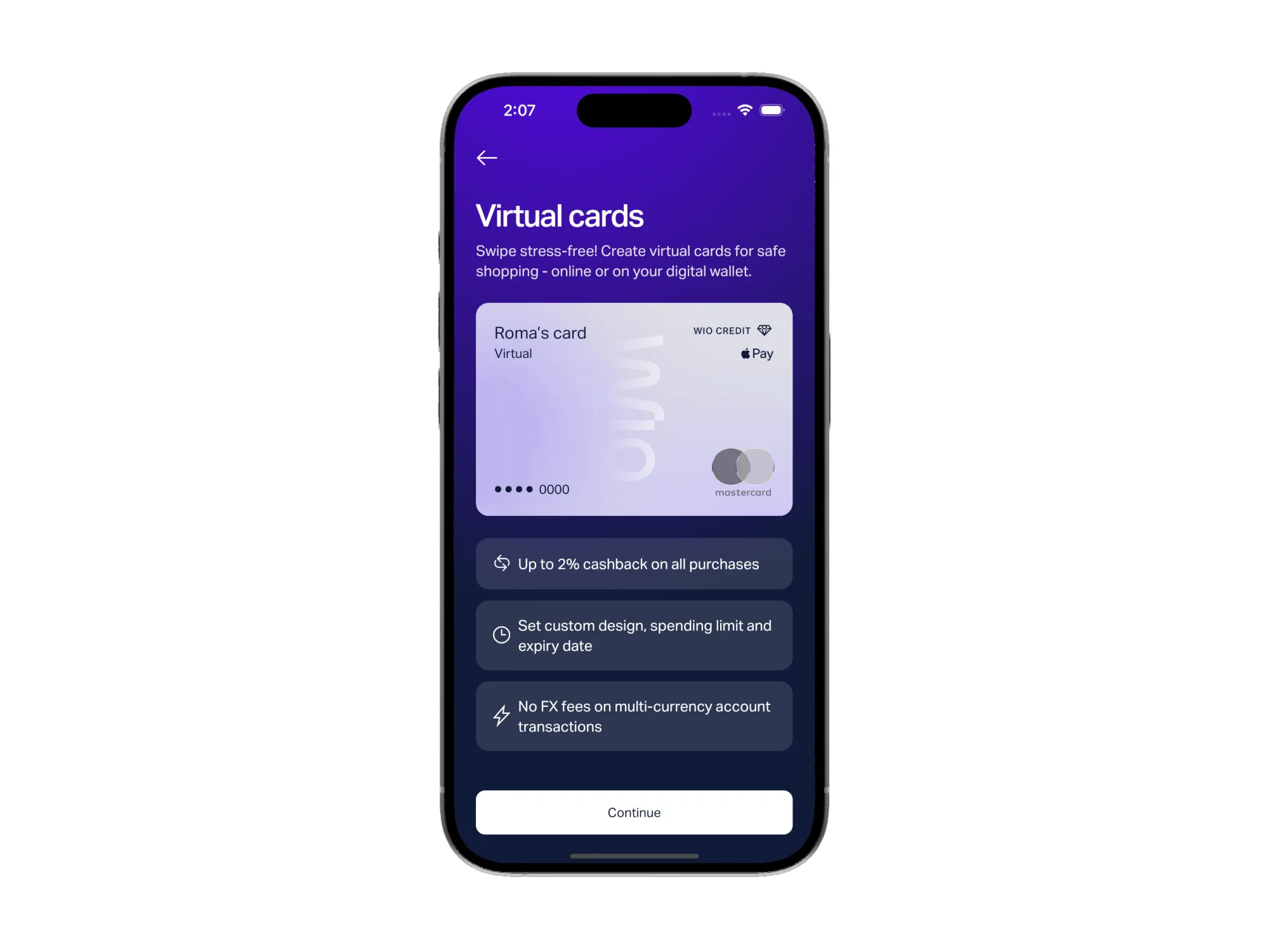
Above you may see the image of the screen. Here virtual card appears by scaling. Indeed it’s a very simple one. As the developer you just need to use already implemented flutter’s transitions like below:
class AnimatedBankCard extends StatefulWidget {
  final Widget child;

  const AnimatedBankCard({
    required this.child,
    Key? key,
  }) : super(key: key);

  @override
  State<AnimatedBankCard> createState() => _AnimatedBankCardState();
}

class _AnimatedBankCardState extends State<AnimatedBankCard>
    with SingleTickerProviderStateMixin {
  late final _controller = AnimationController(vsync: this);

  @override
  void initState() {
    super.initState();
    Future.delayed(_navigationTransitionDuration, _animateCard);
  }

  @override
  void dispose() {
    _controller.dispose();
    super.dispose();
  }

  @override
  Widget build(BuildContext context) {
    return ScaleTransition(
      alignment: Alignment.bottomCenter,
      scale: _controller.view,
      child: widget.child,
    );
  }

  void _animateCard() {
    if (!mounted) return;
    _controller.animateTo(
      1.0,
      duration: _bankCardAnimationDuration,
      curve: Curves.easeInOut,
    );
  }
}
We need to create StatefulWidget with SingleTickerProviderStateMixin to create our own AnimationController. In method 38th we are changing controller’s value from 0 into 1. It means that in _bankCardAnimationDuration time our value is going to rise until 1.0. While it’s rising ScaleTransition in build method will do animation for you. Hence, at the beginning scale of the card is 0. After constant amount of time it’s going to be exactly 1.0.
_controller.animateTo or _controller.forward after finishing navigation transition to avoid some freezes.The list items (3 of them) on bottom also uses one AnimationController. But the thing is that each of the 3 items appears one by one. How can we achieve such behavior with 1 controller? Actually, we could create 3 controllers for each item, but that’s redundant. We are engineers, 1 controller is more than enough, just let’s manipulate the value we are receiving a bit:
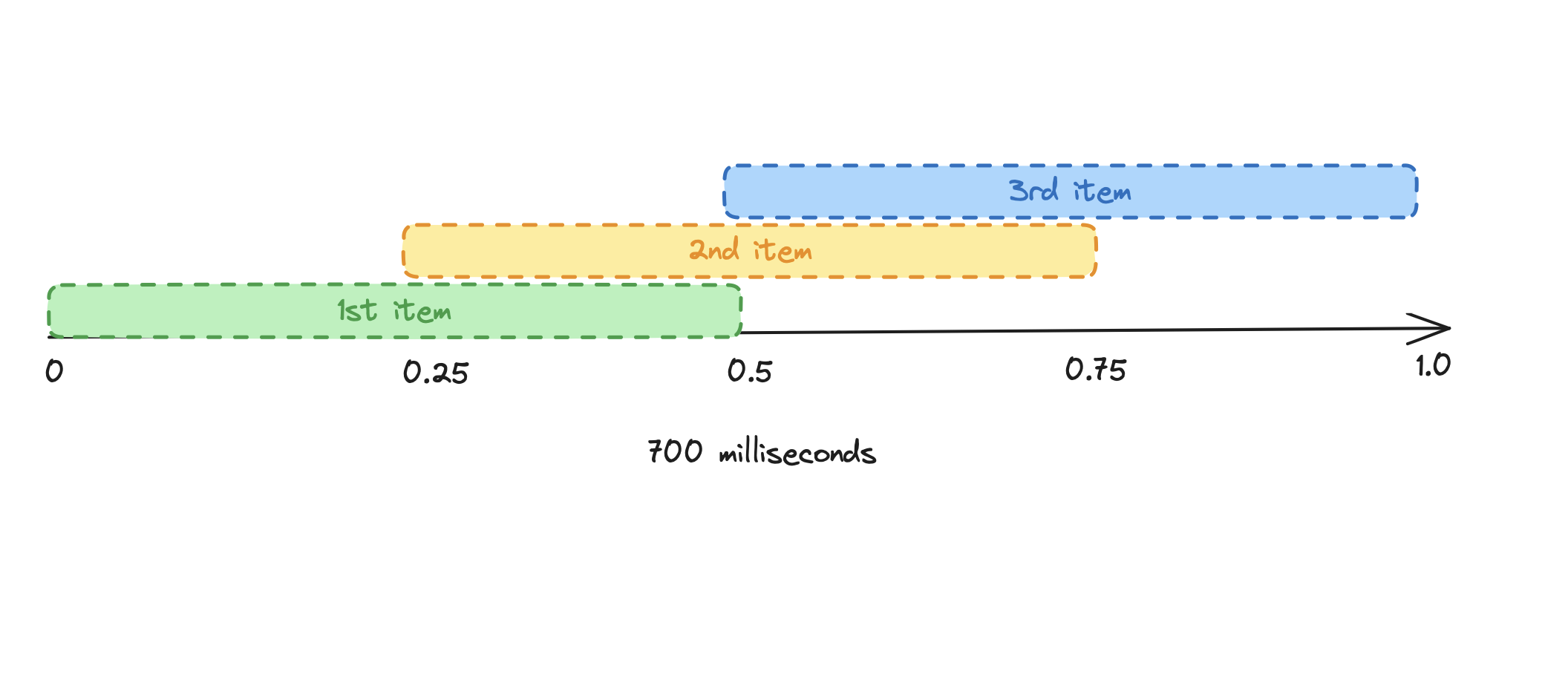
As shown on the image above we can divide 700 milliseconds into several intervals and start each item on specific value of controller. That’s only from logical perspective could be an ideal solution. Therefore, Flutter has support for such functionality from the box. Great news, isn’t it?
First of all we need one Tween:
/// It will interpolate our single controller with intervals, (where each interval has value range from 0 - 1)

final _tween = Tween(begin: 0.0, end: 1.0);
After that, let’s create our single main controller:
late final _controller = AnimationController(
    vsync: this,
    duration: const Duration(milliseconds: 700),
  );
So now we have controller which is going to linearly change its value from 0.0 into 1.0, and tween to interpolate intervals. Next step is to create Animation<double> which is just representation of the animation, which we can’t control, stop, pause, start and e.t.c. Our Animation<double> should raise from 0 into 1.0 in 350ms (0.5x the controller’s value):
Animation<double> _getAnimationForStep(int stepIndex) {
    // 0 - 0.5 # for 1st item
    // 0.25 -> 0.75 # for 2nd item
    // 0.5 -> 1.0 # for third item
    const length = 0.5;
    final start = stepIndex * length / 2;

    return _tween.animate(
      CurvedAnimation(
        parent: _controller,
        curve: Interval(start, start + length, curve: Curves.easeInOut),
      ),
    );
  }
Now we are very close to the finish, all the data needed for perfect UI is ready. All we need to do next is just to create some widget which going to listen that animation and translate the items:
AnimatedBuilder(
    animation: animation,
    builder: (context, _) {
      final val = 1 - animation.value;

      return Transform.translate(
        offset: Offset(val * screenWidth, 0),
        child: child,
      );
    },
  )
On the code snippets above we are passing animation which we got on previous step, and just transforming the items.
In creating new card flow, we have a screen to enter name, spending limit and expiry date. Here we also got power of simple widgets like AnimatedPositioned. You may see that when input is not focused we are showing one title, and when card becomes focused we are moving into another title with list items below.
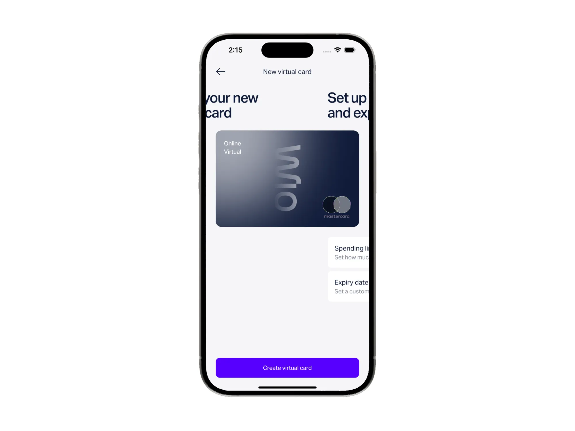
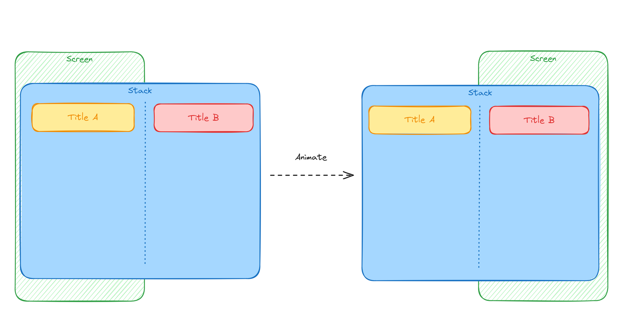
From the Flutter layout structure, everything looks like below. We are using Stack widget so that title’s can be displayed out of the viewport. Regarding moving Text widget, we can apply few different implementations. For instance, we could use AnimatedPositioned for both Text widgets and put just double values for X-axis. In this way, AnimatedPositioned automatically going to switch our title’s. One more approach is to use Transform.translate like in previous snippets.
Let’s try to write some demo code to try to have the same result:
Stack(
    children: [
        // When first child is out of the viewport
        // we can even remove it from the tree.
        if (firstChildOffset != screenWidth)
            Transform.translate(
                offset: Offset(firstChildOffset, 0),
                child: isRtl
                    ? widget.childWhenNameUnfocused
                    : widget.childWhenNameFocused,
            ),
        if (secondChildOffset != screenWidth)
            Transform.translate(
                offset: Offset(secondChildOffset, 0),
                child: isRtl
                    ? widget.childWhenNameFocused
                    : widget.childWhenNameUnfocused,
            ),
    ],
)
So, also very simple and powerful animation made in 20 lines.
Haptic feedback
Haptic feedback - is a usage of the physical vibration to simulate to the user some tactile experience. We all the time trying to think about the experience users are getting from using the application. That’s why some splash/ripple effects are must have for all the clickable operations. Haptic feedback is one more thing which is rare in most of the apps, bust also can give great feedback to the user. For instance, when user is flipping his card, we are applying such effect, and user can feel it like an alive card, isn’t that cool and fun?
Indeed, Flutter has support for that in the SDK, so why not add it?? Just use class HapticFeedback for achieving such functionality.
Conclusion
Animations is a powerful opportunity to increase user experience. Most of the time some simple scale/translate/zoom transitions don't take much time, but makes app smooth and nice to use. Experiment several scenarios with different curves, durations and so on to build the best animation.
By Yerkebulan Yelzhan, Senior Flutter Engineer